

By Jason Snell
May 8, 2020 2:52 PM PT
Last updated July 21, 2020
Fun with Charty: Generating charts with Shortcuts
Note: This story has not been updated since 2020.
When I started Six Colors, I had to start making all my charts for myself. Apple financial charts, product-testing charts, and any other data-visualization I could come up with—all of it had to be generated by me, not from someone on my staff or using a template created by a talented designer.
It’s made me appreciate charts, and the strengths and weaknesses of the charting engine inside Numbers. (I never use Numbers as a spreadsheet, but it’s my charting tool of choice, mostly because its charts are just… nicer.) This year I’ve been trying to make a chart every week, and I’ve mostly succeeded. I think there was only one week all year where there hasn’t been at least one chart posted to this site.
Making charts by hand is labor intensive. But it gets easier if you can make the chart one time and just update the data as new numbers flow in. If that sounds like a job for user automation, you’re singing my tune—and I’m happy to report that the new app Charty is built to add charting capabilities to the iOS Shortcuts app.
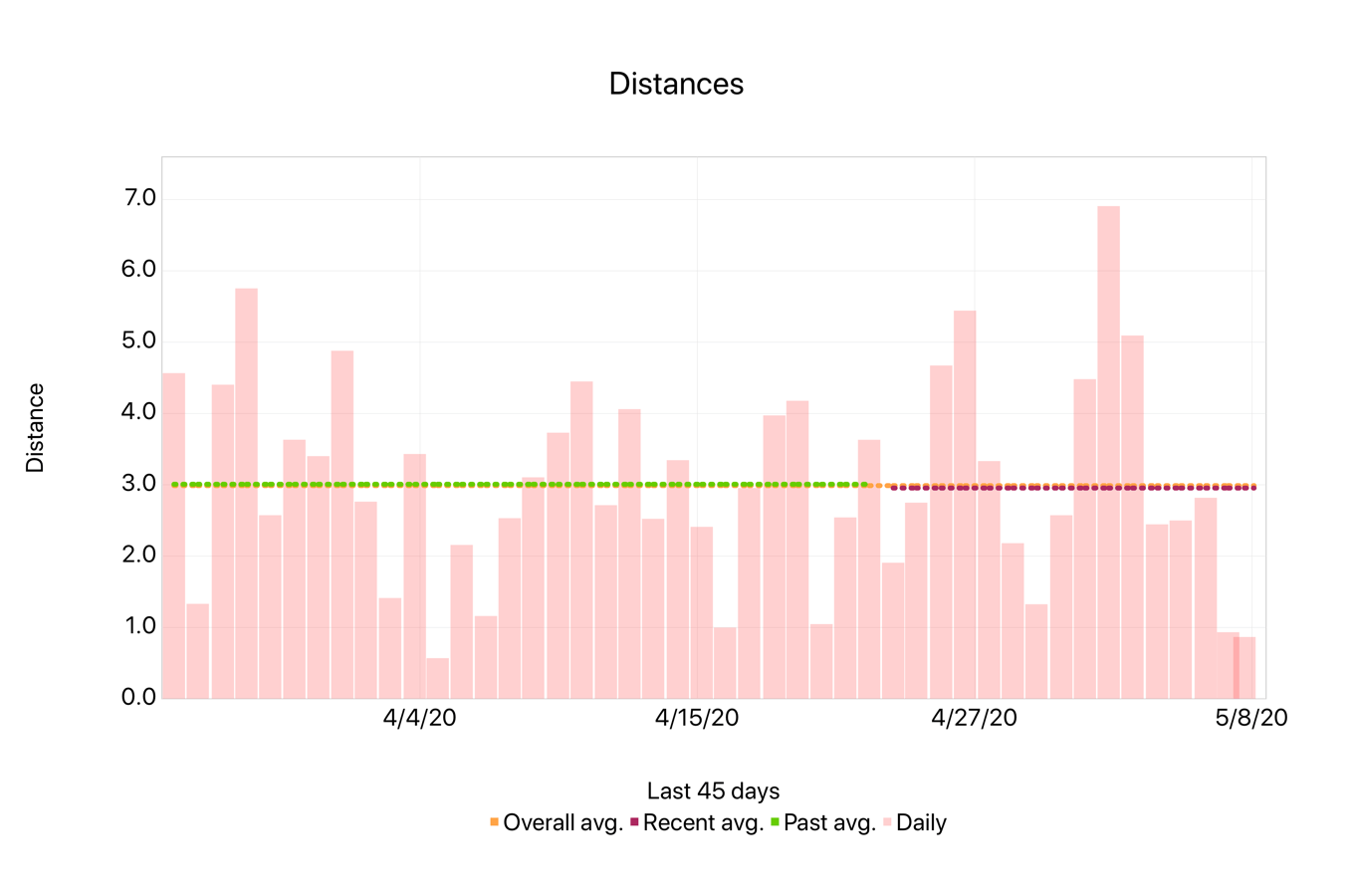
I got to spend a little bit of time with Charty in advance of its release this week, and while bending my mind around a new set of Shortcuts actions takes a little bit of time, I eventually got the hang of it. I got the idea into my head to build a Shortcut that uses data from my weather station to chart the last week’s high and low temperatures. After a back and forth on Twitter with Charty’s developer, Rodrigo Araújo, I managed to get it done:

(Honestly, the trickiest part of the job was generating a data file on my weather station that the shortcut could consume and use as a data source.)
Charty comes with a bunch of example shortcuts that visualize health data, math functions, and more. It’s a free app, but to really use it you’ll want to unlock all the premium features with a one-time in-app purchase. (It’s $2.99 now, rising to $4.99 after this month.)
I’m impressed with where Charty is starting, but as someone who has spelunked every corner of the chart formatting settings in Numbers, there’s plenty of room for more to be added. My basic temperature chart is missing labels on the bars for the temperatures, for example. I’d like to be able to apply custom fonts and sizes for labels, too. And exporting charts out of the app should be a bit more straightforward.
More broadly, I wish Shortcuts was better at parsing remote data sources. This isn’t Charty’s fault, but on my Mac I can pretty easily grep through the source of a web page and pull out all the data I need. Using Shortcuts to attempt the same task made me want to pull my hair out.
Still, I’m looking forward to adding Charty to my set of iOS automation tools. It’s the latest in a series of apps that help expand Shortcuts in interesting ways, following in the footsteps of Data Jar, Toolbox Pro, Pushcut, and LaunchCuts.
If you appreciate articles like this one, support us by becoming a Six Colors subscriber. Subscribers get access to an exclusive podcast, members-only stories, and a special community.